
← All guides
Preview on phones and tablets
Real device emulation: viewport, pixel density, touch and user agent.
- 1
Pick a device
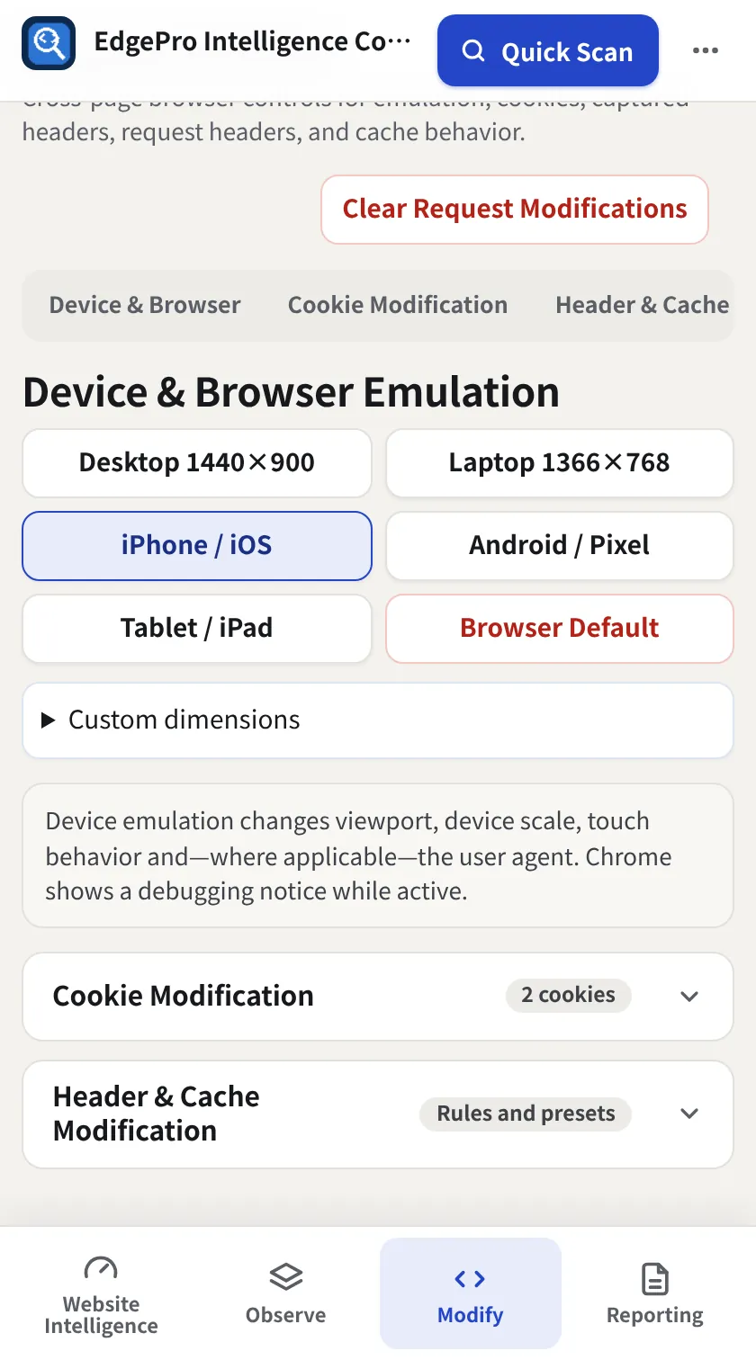
In Modify → Headers & Cookies → Device & Browser choose Desktop 1440×900, Laptop 1366×768, iPhone / iOS, Android / Pixel or Tablet / iPad. The page reloads as that device.
- 2
Custom size
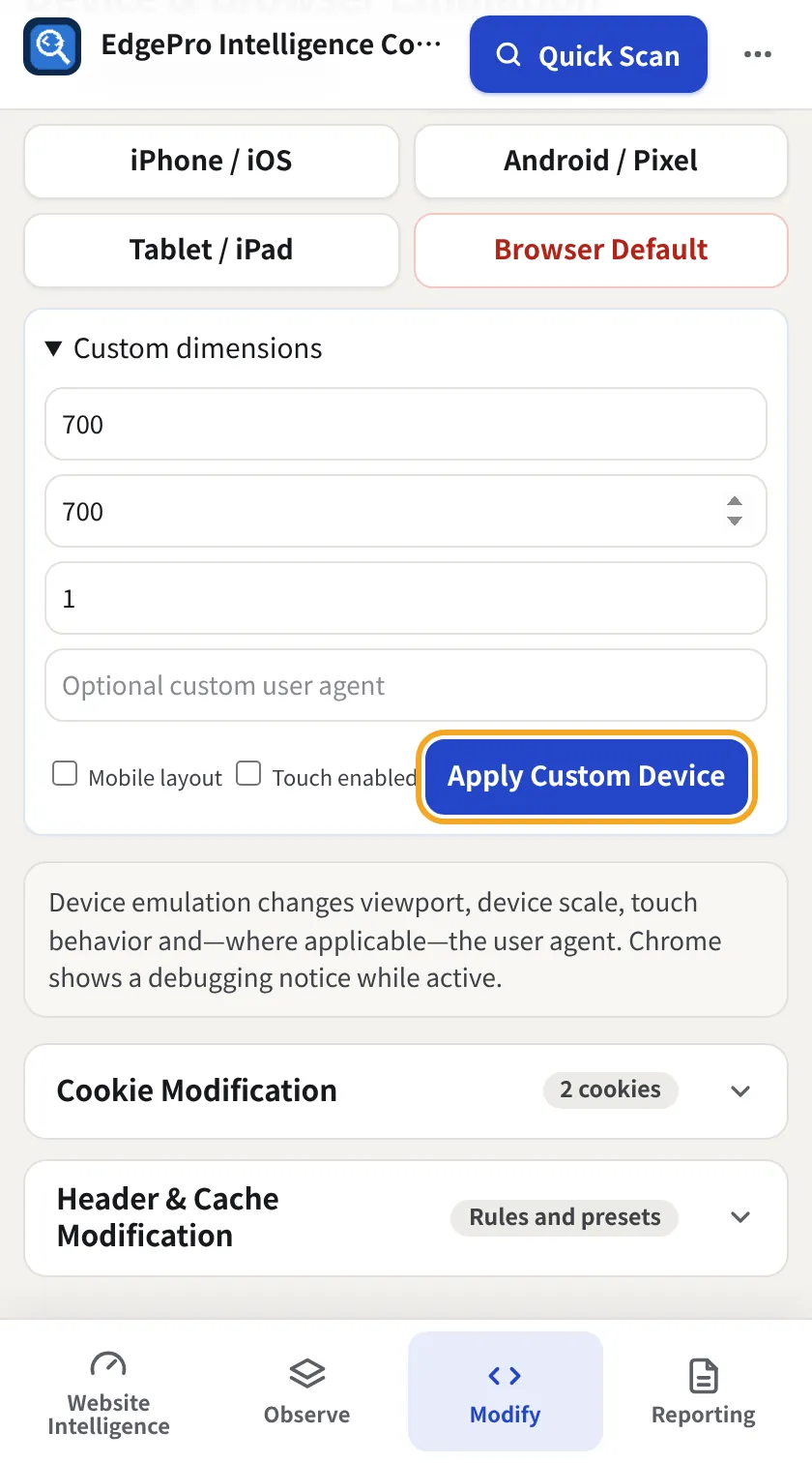
Open Custom dimensions, set width, height, scale and optionally a user agent, Mobile layout and Touch enabled, then Apply Custom Device.
- 3
Back to normal
Browser Default removes the emulation.
Related guides
Modify + Reporting4 minChange the page liveEdit HTML, CSS and JavaScript, block files and compare before/after without changing the real site.Free4 minRecord and check a journeyRecord a contact form, sign-up or checkout once. EPIC re-checks it and tells you if it passed, changed or broke, without ever sending the form.